
Today, we will take a look how simple are basic modifications of your Osclass theme, plugin or simply layout. We strongly recommend to check some CSS basics before you start with modifications. You may find CSS Cheat Sheet at bottom of this guide.
What we are going to do today:
- Hide unwanted box
- Change background color
Find CSS file and line number
Most popular question on forums related to modifications is “What file and line number?”. Well it’s not that hard to find these by yourself. We will be using Google Chrome and their dev console. It’s more-less identical in Firefox. There is no need to install any software, just prepare access to your Osclass theme files (ftp or cpanel).
Hide and remove unwanted box
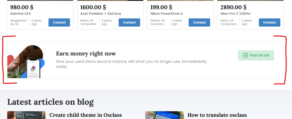
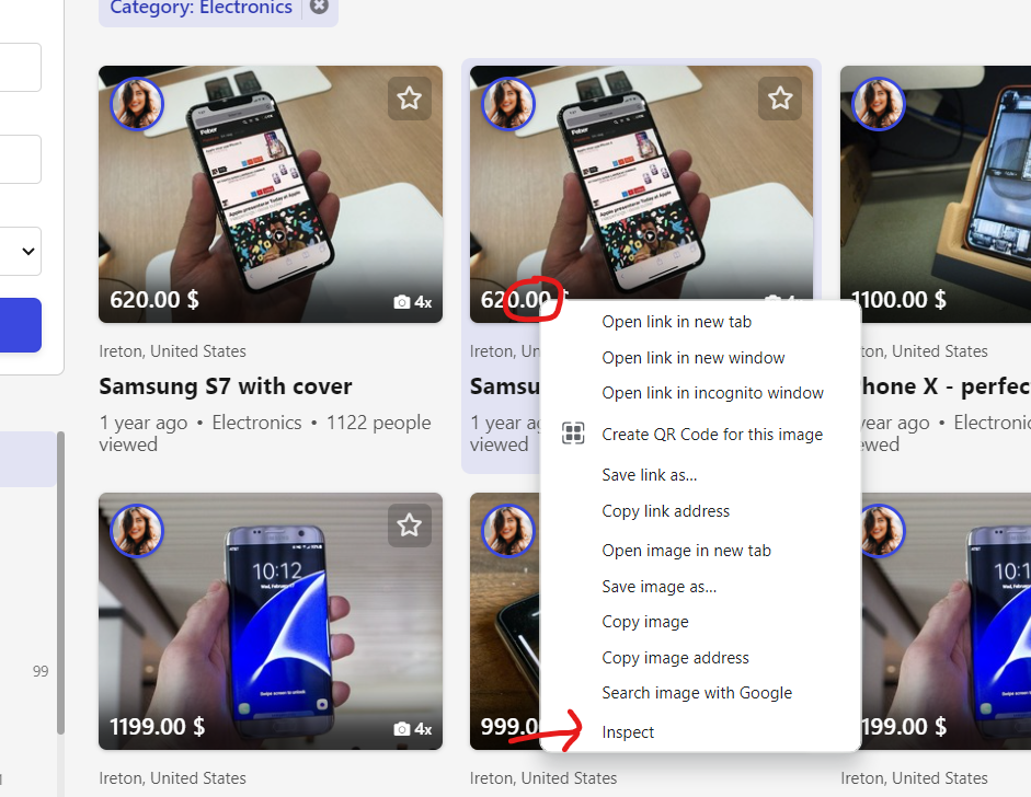
First we try to hide home page box in Delta theme (“Earn money right now”)
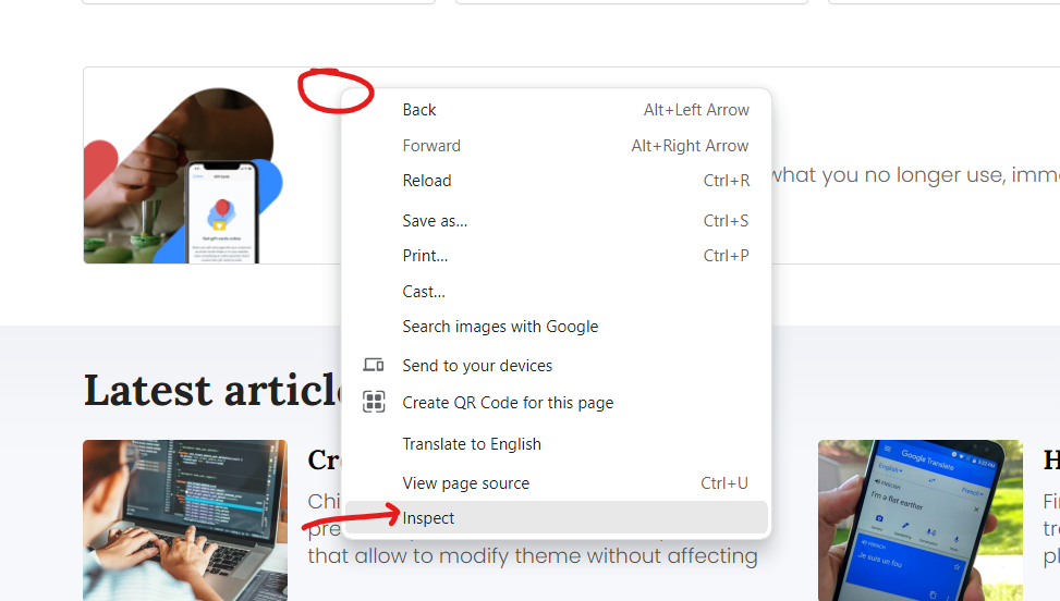
Right click anywhere inside block (ideally close to edge) and click on Inspect option at the end.
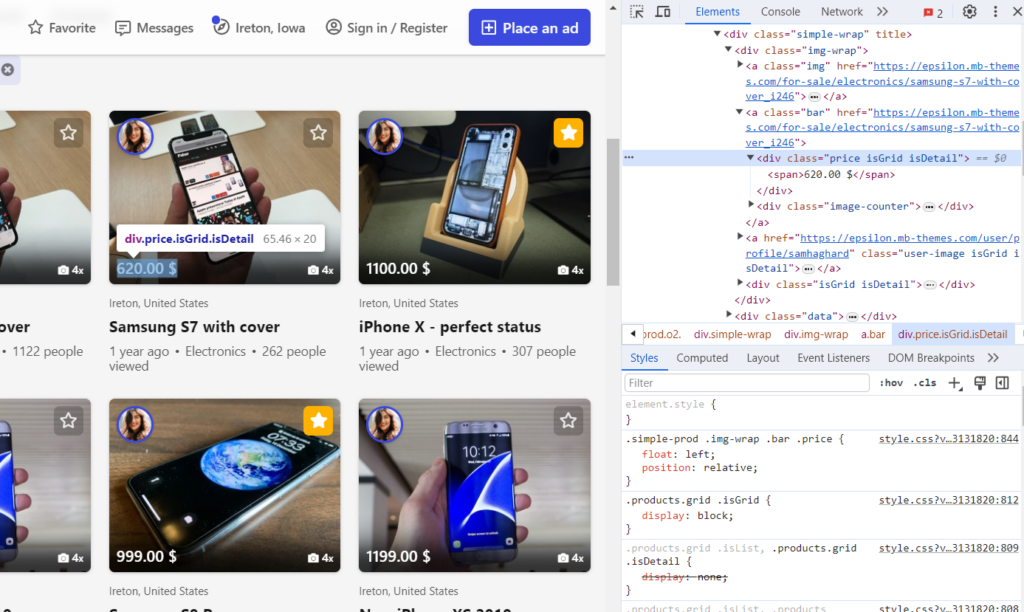
You should now see Chrome DEV console. It may be shown in sidebar, bottom section or in separate window. This is not that important and you can customize it based on your preference.
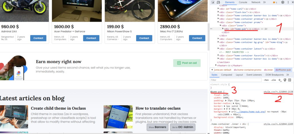
Let’s check what options we got there:
- HTML page structure – You may see structured and formatted HTML code of your classifieds. By default, closest parent element from your right click. You may expand and collapse elements with caret symbol.
- File name and line number – This shows you what is file name and line number of specific code. In this case it’s style.css and line number 2138.
- CSS selector – specify how is selected box identified.
In our case, we want to hide box and keep page nice, so in 1) if you move to div with classes “home-container promo”, it’s most suitable element.
Notice that if you click there, CSS selector is not specific enough for our needs, it’s same for all “home-container” boxes.
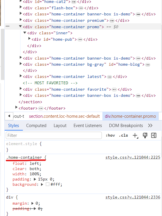
In this case we would need to use CSS selector .home-container.promo to make it unique and do not impact other boxes.
There are 2 ways you may perform your updates:
- Go to specified file and line and update, remove or add new CSS commands
- Go to backoffice > Appearance > Customization and add your CSS code into Your CSS box
Each has pros & cons. Pros for first option is that it’s bit easier and faster. Cons is that with theme/plugin updates, you loose your changes (until you have child theme).
For 2nd option in backoffice, pros is that it’s not impacted by updates, cons is that you usually need to overwrite existing CSS code.
We go for 2nd option with overwrite. In this case our CSS selector must be “stronger” and get prioritized so we can rewrite even same CSS commands. Easiest way for override is to add “body” at start of CSS selector.
As we want to hide box, easiest way is to use display property and use none value.
Final CSS code:
body .home-container.promo {display:none;}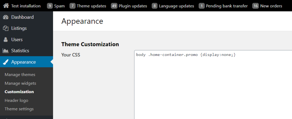
Note that in this case we might not need to add “body” at start of selector, as there is no other command with .home-container.promo selector.
We just finished simple customization of your theme.
Change background color
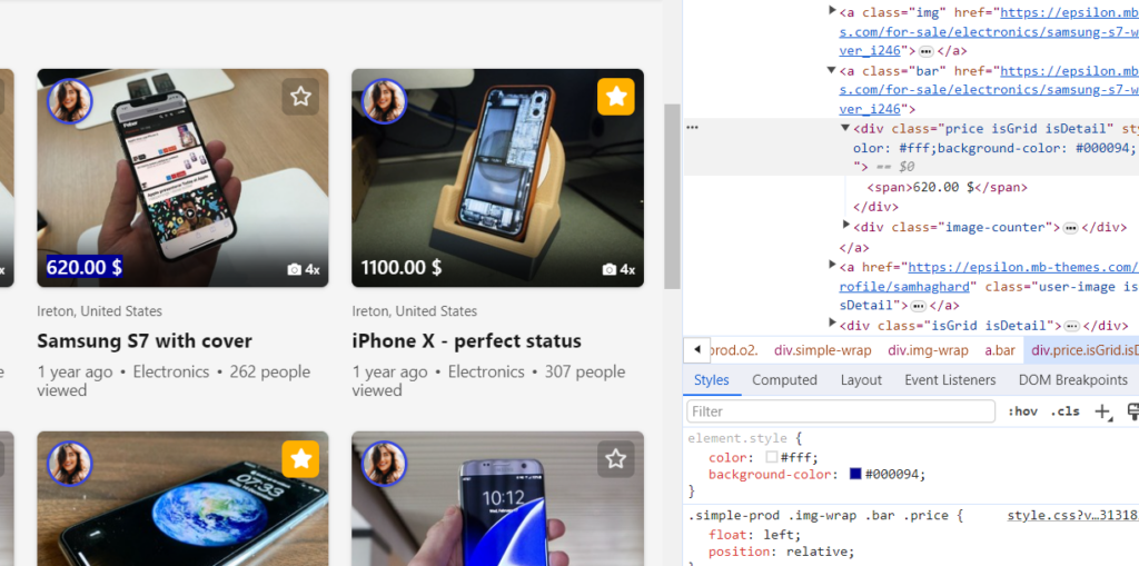
We are now going to change background & font color of price box in Epsilon theme on in search results. Note that search results will share CSS selectors with home page, related items and other sections on your site, so if you want to do it specifically just on search page, use ID on body tag on search page (body#search).
Right-click on price tag in search page and hit Inspect.
Select DIV with class “price” as this one looks to be most suitable and can be uniquely identified/select via selector.
Font color can be changed via color property and background via background-color property. Let’s set font to white (#fff) and background to dark blue (#000094). If you are not sure what are correct commands, values and if they work, you can click into “element.style” area and start typing. We will use Chrome auto-complete and real-time presentation.
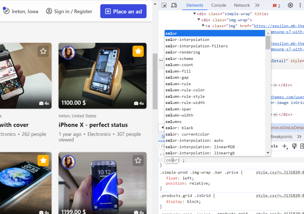
Type these commands:
color: #fff;
background-color: #000094;
Color is now changed on selected DIV.
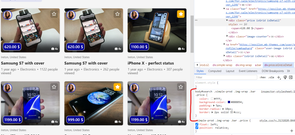
We can now copy our code and put it into Appearance. Final code with minor adjustments like padding, border and border radius to make it look nicer:
body#search .simple-prod .img-wrap .bar .price {
  color: #fff;
  background-color: #000094;
  padding: 5px;
  border-radius: 10px;
  border: 2px solid #ccc;
}
Hope this guide helps you to understand how easy is to do simple customizations in your theme 😉. If you are not sure that CSS is OK, work just in backoffice > Appearance > Customization section, as you may remove all your modifications easily on 1 place.
Note that each CSS command consists from selector and curly brackets. Make sure it’s enclosed ( selector {…css…} ). For easier readability of your mods, it’s better to write 1 CSS code per line (experience) as putting each CSS property per line is quite overkill on complex sites:
body#search .simple-prod .img-wrap .bar .price { color: #fff; background-color: #000094; padding: 5px; border-radius: 10px; border: 2px solid #ccc; }CSS Cheat Sheet
Quick cheatsheet to cascading styles from dev.to website.
Selectors
Universal Selector * {}
Type Selector h1, h2 ,h3 {}
Child Selector ul > li {}
Descendant Selector p a {}
Class Selector .class {}
ID Selector #id {}
Adjacent Sibling Selector h1 + p {}
General Sibling Selector h1 ~ p {}
Attribute Selector [attribute="SomeValue"] {}
Pseudo Selectors & Elements
Mouse Over Selector a:hover {}
Active Link Selector a:active {}
Focus Selector input:focus {}
Visited Links Selector a:visited {}
Link Selector .class:link {}
First Line Selector p::first-line {}
First Letter Selector p::first-letter {}
First Child Selector p:first-child {}
Last Child Selector p:last-child {}
Only Child Selector p:only-child {}
:nth-child Selector p:nth-child() {}
First Element of its Parent Selector p:first-of-type {}
Checked elements selector input:checked {}
Disabled elements selector input:disabled {}
Enabled elements selector input:enabled {}
Elements that have no Children Selector (including text nodes) p:empty {}
Not a Specified Element Selector :not(p) {}
Before Element .class::before {}
After Element .class::before {}
Text Styling
Font style font-style: normal | italic | oblique
Font Variant font-variant: normal | small-caps
Font Weight font-weight: normal | bold | bolder | lighter | 100 - 900
Vertical Alignment vertical-align: baseline | 10px | sub | super | top | text-top | middle | bottom | text-bottom | initial
Font Size font-size: 12px | 0.8em | 80%
Text Transform text-transform: capitalise | lowercase | uppercase
Space Between Characters letter-spacing: normal | 4px
Line Height line-height: normal | 3em | 34%
Horizontal Alignment text-align: left | right | center | justify
Text Align Last text-align-last: auto | left | right | center | justify | start | end | initial | inherit
Text Decoration text-decoration: none | underline | overline | line-through
Indent First Line text-indent: 25px
Font Family font-family: 'Open Sans', sans-serif
Text Justify text-justify: auto | inter-word | inter-character | none | initial | inherit
Text Overflow text-overflow: clip | ellipsis | string | initial | inherit
Text Shadow text-shadow: h-shadow v-shadow blur-radius color | none | initial | inherit
Position
Position position: static | relative | absolute | fixed | sticky
Position Properties top | right | bottom | left
Float Element float: left | right | none
Clear Floating Elements clear: none | left | right | both
Z Index z-index: 3 | auto | inherit
Background
Background Image background-image: url()
Background Repeat background-repeat: repeat-x | repeat-y | repeat | space | round | no-repeat
Background Color background-color: #2AA9E0
Background Position background-position: top | right | bottom | left | center
Background Attachment background-attachment: scroll | fixed | local | initial | inherit
Box properties
Box Sizing box-sizing: border-box | content-box
Margin margin: 2px 4px 6px 8px | 0 auto
Padding padding: 2px 4px 6px 8px
Border Color border-color: #2AA9E0
Border Style border-style: none | hidden | dotted | dashed | solid | double | groove | ridge | inset | outset
Border Width border-width: 10px
List Styling
List Type list-style-type: disc | circle | square | none
List Position list-style-position: inside | outside
List Image list-style-image: url()
Flexbox
Flex Direction flex-direction: row | row-reverse | column | column-reverse
Flex Wrap flex-wrap: nowrap | wrap | wrap-reverse
Justify Content justify-content: flex-start | flex-end | center | space-between | space-around | space-evenly
Align Items align-items: flex-start | flex-end | center | baseline | stretch
Align Content align-content: flex-start | flex-end | center | space-between | space-around | stretch
Order order: 0
Flex Grow flex-grow: 0
Flex Shrink flex-shrink: 1
Flex Basis flex-basis: 3px | auto
Align Self align-self: auto | flex-start | flex-end | center | baseline | stretch
CSS Grid
Grid Template Columns grid-template-columns: 40px 50px auto 50px 40px
Grid Template Rows grid-template-rows: 25% 100px auto
Grid Template Areas grid-template-areas: "a b c" | none
Grid Template grid-template: "a a a" 20% "b b b" auto | 100px 1fr / 50px 1fr
Grid Column Gap grid-column-gap: 10px
Grid Row Gap grid-row-gap: 10px
Justify Items justify-items: start | end | center | stretch
Align Items align-items: start | end | center | stretch
Justify Content justify-content: flex-start | flex-end | center | space-between | space-around | space-evenly
Align Content align-content: flex-start | flex-end | center | space-between | space-around | stretch
Grid Auto Columns grid-auto-columns: 100px | max-content | min-content
Grid Auto Rows grid-auto-rows: 100px | max-content | min-content
Grid Auto Flow grid-auto-flow: row | column | row dense | column dense
Grid Column Start grid-column-start: 2 | areaname | span 2 | span areaname | auto
Grid Column End grid-column-end: 2 | areaname | span 2 | span areaname | auto
Grid Row Start grid-row-start: 2 | areaname | span 2 | span areaname | auto
Grid Row End grid-row-end: 2 | areaname | span 2 | span areaname | auto
Grid Column grid-column: 3 / span 2
Grid Row grid-row: 3 / span 2
Justify Self justify-self: start | end | center | stretch
Align Self align-self: start | end | center | stretch
Dynamic Content
CSS Variable --variable-name: value
Variable Usage var(--variable-name)
Counter Reset counter-reset: name-of-counter
Counter Increment counter-increment: name-of-counter
Counter Dynamic Value content: counter(name-of-counter)
Attribute Dynamic Value content: attr(name-of-attribute)